Code
import matplotlib.pyplot as plt
import seaborn as snsWe create a correlation matrix to explore how the variables are statistically related. For exploratory purposes, I included variables that were used in intermediate processing steps, in addition to the 10 variables of interest for our modelling.
import matplotlib.pyplot as plt
import seaborn as sns# Create a list of all variables
variables = ['MedHHInc','TotalPop', 'TotalPop16', 'LabForTotal', 'Unemployed','PctBach', 'PovertyRate', 'UnemploymentRate', 'LabForParticipationRate', 'netexport', 'REALGDP', 'life_expectancy', 'Labor_Productivity_2023', 'REALGDPpercapita']
# Create a list of selected variables for later analysis
selected_variables = ['REALGDPpercapita','life_expectancy','MedHHInc','PctBach','UnemploymentRate','LabForParticipationRate', 'Labor_Productivity_2023', 'TotalPop', 'PovertyRate', 'netexport']
# Calculate the correlation matrix
corr_matrix = us_rescaled_final[variables].corr()
# Plot the correlation matrix using seaborn
plt.figure(figsize=(10, 8))
sns.heatmap(corr_matrix, annot=True, cmap='coolwarm', vmin=-1, vmax=1)
plt.title('Correlation Matrix')
plt.show()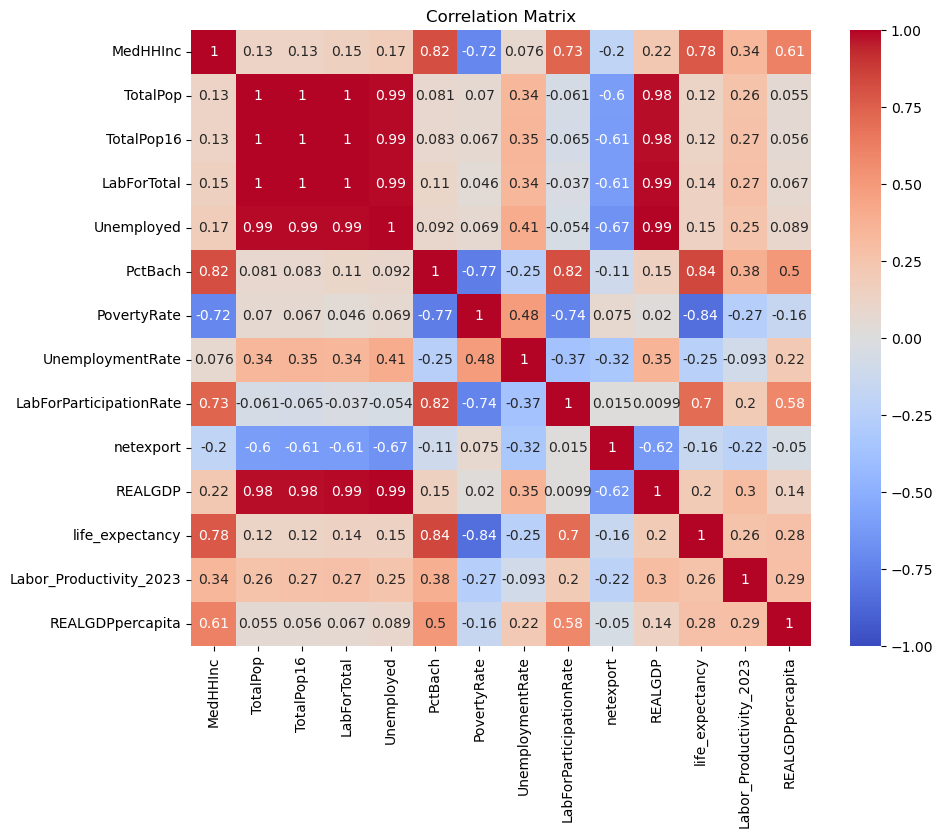
We observe some interesting correlations. Real GDP has high positive correlation with population, size of labour force and number of employed. When these variables are converted into ratios such as labour force participation rate and unemployment rate, the correlation becomes weaker.
There are some reasonable correlation expectations. For example, percentage of bachelor’s degree graduates has a high negative correlation with poverty rate and a high positive correlation with median household income, labor force participation rate and life expectancy. Meanwhile. poverty rate has high negative correlation with median household income, labor force paritcipation rate and life expecatancy.
We can visualise these relationships further using line charts. I first create a repeated chart for all the variables. From an aesthetic perspective, the visualization can be improved further.
import altair as alt# Setup the selection brush
brush = alt.selection_interval()
# Repeated chart
(
alt.Chart(us_rescaled_final)
.mark_circle()
.encode(
x=alt.X(alt.repeat("column"), type="quantitative", scale=alt.Scale(zero=False)),
y=alt.Y(alt.repeat("row"), type="quantitative", scale=alt.Scale(zero=False)),
color=alt.condition(
brush, "NAME_x:N", alt.value("lightgray")
), # conditional color
tooltip=['NAME_x'] + variables
)
.properties(
width=200,
height=200,
)
.add_params(brush)
.repeat( # repeat variables across rows and columns
row=variables,
column=variables,
)
)We can improve the visualisation by creating an interactive bubble plot inspired by Gapminder: https://www.gapminder.org/tools/#$chart-type=bubbles&url=v2. This allows us to select the variables we are interested in and see their distribution
# Define dropdown bindings for both x and y axes
dropdown_x = alt.binding_select(
    options=['MedHHInc','TotalPop', 'TotalPop16', 'LabForTotal', 'Unemployed','PctBach', 'PovertyRate', 'UnemploymentRate', 'LabForParticipationRate', 'netexport', 'REALGDP', 'life_expectancy', 'Labor_Productivity_2023'],
    name='X-axis column '
)
dropdown_y = alt.binding_select(
    options=['MedHHInc','TotalPop', 'TotalPop16', 'LabForTotal', 'Unemployed','PctBach', 'PovertyRate', 'UnemploymentRate', 'LabForParticipationRate', 'netexport', 'REALGDP', 'life_expectancy', 'Labor_Productivity_2023'],
    name='Y-axis column '
)
dropdown_size = alt.binding_select(
    options=['MedHHInc','TotalPop', 'TotalPop16', 'LabForTotal', 'Unemployed','PctBach', 'PovertyRate', 'UnemploymentRate', 'LabForParticipationRate', 'netexport', 'REALGDP', 'life_expectancy', 'Labor_Productivity_2023'],
    name='Bubble Size '
)

# Create parameters for x and y axes
xcol_param = alt.param(
    value='MedHHInc',
    bind=dropdown_x
)
ycol_param = alt.param(
    value='MedHHInc',
    bind=dropdown_y
)
size_param = alt.param(
    value='MedHHInc',
    bind=dropdown_size
)

chart2 = alt.Chart(us_rescaled_final).mark_circle().encode(
    x=alt.X('x:Q', scale=alt.Scale(zero=False, domain='unaggregated')).title(''),
    y=alt.Y('y:Q', scale=alt.Scale(zero=False, domain='unaggregated')).title(''),
    size=alt.Size('size:Q', scale=alt.Scale(zero=False, domain='unaggregated')).title(''),
    color='NAME_x:N',
    tooltip=['NAME_x'] + variables  # Concatenate NAME_x with the existing variables list
).transform_calculate(
    x=f'datum[{xcol_param.name}]',
    y=f'datum[{ycol_param.name}]',
    size=f'datum[{size_param.name}]'
).add_params(
    xcol_param,
    ycol_param,
    size_param,
).properties(width=800, height=800)

chart2